

Job-O
Staffing Mobile App

PROJECT OVERVIEW
Project: Job-O
Industry: Staffing & Recruiting
Date: 2020 - 2021
Duration: 10 months
Role: UX/UI Designer
Tools: Pen + Paper, Sketch, InVision, Artboard Studio
Job-O is a staffing app that connects hiring managers with talent for short-term jobs, with the flexibility to hire who you want and do what you want when you want.
I was brought in to conceptualize an existing staffing app idea serving users (workers) and businesses (hiring managers). Due to a non-disclosure agreement (NDA) I've signed, I can only share my design process for the initial version of the app with the founder's permission.
Design Process

A- CLIENT SIDE
For hiring managers / businesses looking for talents / workers for in-demand shifts.
1. DISCOVERY
The Problem
There are about one million employees who have two or more jobs simultaneously in Canada. Also, multiple job workers in the U.S. are 10% of the workforce. Students, newcomers, employed or unemployed talents who want to make more money in their free time have difficulty finding last-minute work or getting accepted quickly to those shifts. On the other hand, finding last-minute staff can become overwhelming for hiring managers when short-staffed.
The Solution
A tool that enables hiring managers find talents and allow talents find short-term or temporary jobs
A tool with a client-side (hiring managers) and a user side (talents)
Must be easy to access and simple to use and navigate anytime/anywhere
Constraints
Limited time and budget
COVID-19’s negative impact on industries
Being the only UX/UI Designer challenged me at the beginning, but I started the project, executed, and finalized it on estimated time
Proto-Persona

Step 1 - User Interviews
USER PAIN POINTS
Managers often fall short-staffed when talents are unavailable or sick, and it's not easy or fast to find a substitute on the same day
Some industries are more fast-paced, like food and hospitality, so it gets overwhelming to find last-minute talents for managers from those industries

USER GOALS
They need short-term/temporary talents/workers with flexibility and last-minute availability
They want alternative ways to reach out to those talents and save their info to book them for relevant future shifts

Step 2 - Competitive Analysis
I conducted a competitive analysis where I compared four existing staffing apps. I focused on evaluating their usability, features, and design. Additionally, I identified weaknesses in these apps and kept that data for future reference, which will help me develop more creative solutions to stand out in the market.

Step 3 - Key Takeaways
USER RESEARCH
When clients are short-staffed or have extra last-minute shifts to fill, they want to find talents for temporary or short-term jobs based on their needs and availability. This hiring process should be as fast and simple as possible.
COMPETITIVE ANALYSIS
After conducting a competitive analysis on direct competitors, I identified strengths and weaknesses focused on usability, aesthetics, and features, so my goal was to design an app as user-friendly as possible after reviewing the users' feedback on others.
2. DEFINE
Step 1 - Personas
I created two personas based on the data I received from users to identify their motivations, goals, and pain points.


Step 2 - Journey Map
For this stage, I've developed a journey map to illustrate the users' interaction with the product, including their thoughts, feelings, and emotions.

Step 3 - Information Architecture (IA)
Information architecture (IA) focuses on organizing, structuring, and logically labeling content, so I created one to set the structure of my app.

Step 4 - Site Mapping

For site mapping, I organized data based on user needs and business goals to determine information priority.
Back to Research for Exploring Payment Gateways!
Step 5 - Payment Gateways Integration with Developers
After getting direction from developers, I started researching payment gateways to ensure that our users receive payment for their shifts through the app. I researched to identify the most suitable and user-friendly payment gateway system.
I compared Stripe, Braintree, WePay, PayPal, and BlueSnap, and gained valuable insights into the user experience. Additionally, I discussed the options with the team and ultimately selected Stripe as our solution due to its developer-friendly nature and well-known features.

Step 6 - Task Flow
To ensure clarity in the app for further testing, I created a user task flow. The task involves finding an immediate shift and consists of 5 steps for users to complete.
Task: Posting a shift
Sub-task: Hiring an applicant

3. IDEATE
Step 1 - Sketches
As the first step in the ideation stage, I began by sketching ideas with pen and paper before converting them into digital wireframes.

Step 2 - Lo-Fi Wireframes
As part of the second ideation step, I created digital wireframes based on the previous sketches.

Step 3 - User Test #1
To test the app's functionality, I conducted a user test with five participants. Using a defined script and a prototype, I had users complete the task of posting a shift.
Participants: 5
Task: Posting a shift
Sub-task: Hiring an applicant
Total hours: 5 hours
User Insights & Feedback: Users find the app intuitive and easy to navigate after becoming more familiar with its features. They all successfully completed the task and provided constructive feedback for future iterations.

Iteration for the post page:
Users have expressed confusion regarding the send and post buttons on the main page. The send button currently means sending the shift to favourite people from previous shifts, while the post button means posting a shift. Users find both buttons confusing and overwhelming.
Our proposed solution is to keep only the post button and modify the process so that users can send the shift to their favourite people.

Post a Shift Page
Iteration for the shift details page:
Users require a larger clickable area to successfully hire an applicant.

Step 4 - Moodboard
I have gathered a collection of images to create a mood board showcasing various industries, such as hospitality, logistics, retail, and more.

Step 5 - UI Style Tile
A UI style tile contains various elements such as colours, typography, shapes, iconography, images, graphics, buttons, and other UI elements that are visual components of the product that the users interact with, so I created one showing all the elements by following the IOS standards.

Step 6 - Hi-Fi Wireframes
With UI tile, I created high-fidelity wireframes for the next testing session.

4. FINAL TESTING & ITERATIONS
Step 1 - User test #2
This time, I conducted a user test with five participants to evaluate the app's functionality and aesthetics after applying UI to my design.
Participants: 5
Task: Posting a shift
Sub-task: Hiring an applicant
Total hours: 4 hours
User Insights: During the moderated user testing session, I closely observed the participants' reactions, body language, and facial expressions to enhance the value of my results. The UI design received positive feedback, appearing friendly and motivating to users. Despite the complexity of the product and the tasks, the success rate was over 85%.

Step 2 - Iterations
User Feedback: Based on the feedback, users prefer to see a darker color after clicking on a date, so I added a blue box for better visibility.

Payement Gateway Integration, Stripe
The final look of the pages where users can access accounts, and Stripe was chosen for integration.

Step 3 - Hi-Fi Prototype
I created a high-fidelity prototype using the style guide, presented it to stakeholders for feedback and comments, and repeated this process until their feedback no longer led to changes.

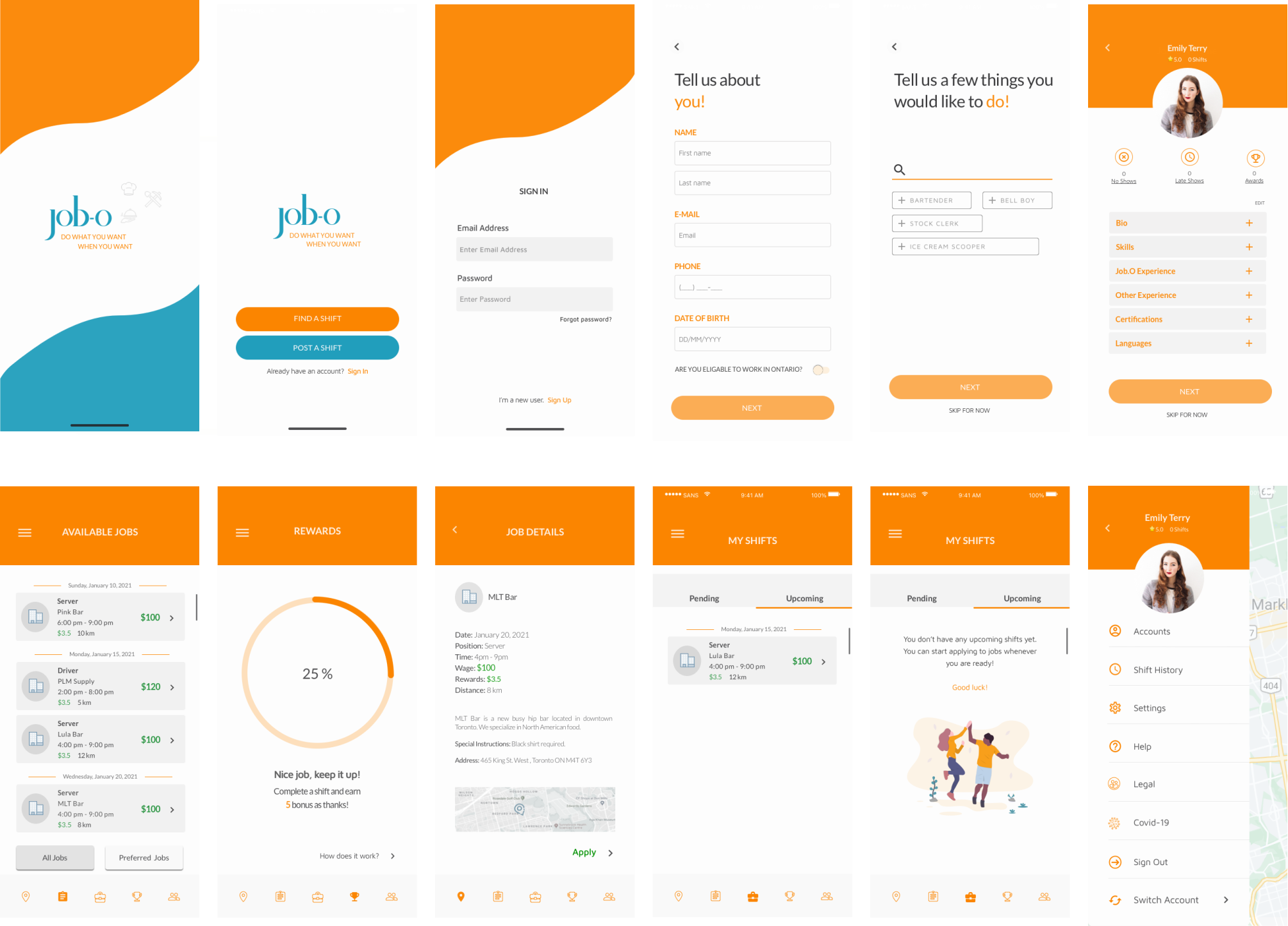
5. DELIVER
Outcomes
I designed and delivered 400+ screens for the client side
After testing and iterations, screens were delivered to developers
The development phase started for the app
B- USER SIDE
For part-time / short-term workers looking for instant shifts.
1. DISCOVERY
The Problem
There are about one million employees who have two or more jobs simultaneously in Canada. Also, multiple job workers in the U.S. are 10% of the workforce. Students, newcomers, employed or unemployed talents who want to make more money in their free time have difficulty finding last-minute work or getting accepted quickly to those shifts. On the other hand, finding last-minute staff can become overwhelming for hiring managers when short-staffed.
The Solution
A tool that enables hiring managers find talents and allow talents find short-term or temporary jobs
A tool with a client-side (hiring managers) and a user side (talents)
Must be easy to access and simple to use and navigate anytime/anywhere
Constraints
Limited time and budget
COVID-19’s negative impact on industries
Being the only UX/UI Designer challenged me at the beginning, but I started the project, executed, and finalized it on estimated time
Proto-Persona

Step 1 - User Interviews
USER PAIN POINTS
They want a second job but don't want to commit to a contract
They make enough money to make ends meet only
They could spend their free days in a more productive way
USER GOALS
They want to save some extra money
They want to be flexible and work whenever they want
They don't make enough money to spend on their interests
Step 2 - Competitive Analysis
I conducted a competitive analysis where I compared four existing staffing apps. I focused on evaluating their usability, features, and design. Additionally, I identified weaknesses in these apps and kept that data for future reference, which will help me develop more creative solutions to stand out in the market.
Step 3 - Key Takeaways
USER RESEARCH
Users are interested in finding temporary jobs that suit their availability without committing to a contract or plan in advance. Their biggest motivation is to supplement their regular income to save or spend more on their hobbies or necessities.
COMPETITIVE ANALYSIS
After conducting a competitive analysis on direct competitors, I identified strengths and weaknesses focused on usability, aesthetics, and features, so my goal was to design an app as user-friendly as possible after reviewing the users' feedback on others.
2. DEFINE
Step 1 - Personas
I created two personas based on the data I received from users to identify their motivations, goals, and pain points.


Step 2 - Journey Map
For this stage, I've developed a journey map to illustrate the users' interaction with the product, including their thoughts, feelings, and emotions.

Step 3 - Information Architecture (IA)
Information architecture (IA) focuses on organizing, structuring, and logically labeling content, so I created one to set the structure of my app.

Step 4 - Site Mapping

For site mapping, I organized data based on user needs and business goals to determine information priority.
Step 5 - Payment Gateways Integration with Developers
As mentioned on the client side, we chose Stripe after comparing payment gateways and decided to use the same gateway for talents to receive timely payments. Stripe remains the most suitable and user-friendly payment gateway system for this aspect of the app.
Step 6 - Task Flow
To ensure clarity in the app for further testing, I created a user task flow. The task involves finding an immediate shift and consists of 5 steps for users to complete.
Task: Find a shift
Sub-task: View pending shifts after applying

3. IDEATE
Step 1 - Sketches
As the first step in the ideation stage, I began by sketching ideas with pen and paper before converting them into digital wireframes.

Step 2 - Lo-Fi Wireframes
As part of the second ideation step, I created digital wireframes based on the previous sketches.

Step 3 - User Test #1
To test the app's functionality, I conducted a user test with five participants. Using a defined script and a prototype, I had users complete the task of finding a shift.
Participants: 5
Task: Finding a shift
Sub-task: View pending shifts after applying
Total hours: 6 hours
User Insights & Feedback: Users find the app easy to navigate after getting more familiar with what it offers and they also find it user-friendly for someone who looks for instant shifts. Some feedback mentions some words being unfamiliar, map icons and typography being too small.
Step 4 - Moodboard
Collecting inspiration for redesign.

Step 5 - UI Style Tile
A UI style tile contains various elements such as colours, typography, shapes, iconography, images, graphics, buttons, and other UI elements that are visual components of the product that the users interact with, so I created one showing all the elements by following the IOS standards.

Step 6 - Hi-Fi Wireframes
With UI tile, I created high-fidelity wireframes for the next testing session.
4. FINAL TESTINGS & ITERATIONS
Step 1 - User test #2
This time, I conducted a user test with five participants to evaluate the app's functionality and aesthetics after applying UI to my design.
Participants: 5
Task: Finding a shift
Sub-task: View pending shifts after applying
Total hours: 4 hours
User Insights: During the moderated user testing session, I closely observed the participants' reactions, body language, and facial expressions to enhance the value of my results. The UI design received positive feedback, appearing friendly and motivating to users. Despite the complexity of the product and the tasks, the success rate was over 90%.
Step 2 - Iterations
User Feedback: Based on the feedback received, users require an indicator of the applied status. As shown below, a highlighted box has been added as an indicator

Step 3 - Hi-Fi Prototype
I created a high-fidelity prototype using the style guide, presented it to stakeholders for feedback and comments, and repeated this process until their feedback no longer led to changes.

5. DELIVER
Outcomes
UI library is created
I designed and delivered 800+ screens for the client and the user side
After testing and iterations, screens were delivered to developers
We finished the design part of the project on time despite the pandemic delaying things

UI Library
Even though we were usually on schedule with the design and logistics, the pandemic delayed things in the project and in team members' lives. Industries were affected and hit by the wave of it, making it even harder to reach out to the leaders and communicate with them regarding the project. This was my very first job after graduation. It helped me learn, practice a lot, and sometimes figure things out on my own, but it also made me struggle as a fresh designer.
Job-O was my very first start-up experience after graduation. It helped me learn, practice a lot, and sometimes figure things out on my own, but it also made me struggle as a fresh designer. In the end, I am happy to have taken on the responsibility of designing a complex app. I am extremely thankful for the project and the team!
Thanks for reading!